
General
Best Time to Send an Email: A Comprehensive Guide
Discover the best time to send emails by industry, audience, and time zone so your campaigns earn higher open rates, clicks, replies, and conversions every day.
I’m trying to send a personal email newsletter to a small list of friends to share life updates, and I’d like it to look polished and visually fun when it’s opened in an inbox.
I mocked up the layout in a design tool, but I’m not sure how to turn that into an actual email (with real text and images) instead of sending a single big image attachment. I’ve also found some email marketing tools’ templates hard to customize.
Which email marketing platform is best for an easy-to-design personal newsletter, and what’s the simplest way to convert a design into an email-friendly layout?
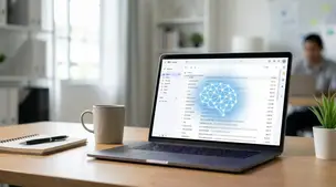
Hi! For a small personal newsletter to friends that still looks polished, the “best” platform is usually the one that lets you design quickly with drag‑and‑drop blocks and doesn’t fight you—most people in your situation end up happiest with something like MailerLite (easy visual editor + good-looking templates) or ConvertKit (super simple, more “letter” style, but can still look clean). If you want the absolute easiest “write + send” experience and don’t care as much about custom layout, Substack is hard to beat—but it’s less flexible if you’re trying to match a detailed mockup.
On turning your design mockup into a real email: the simplest approach is to rebuild the layout using email-friendly blocks (text + images + buttons) rather than exporting the whole thing as one giant image. Email clients don’t handle complex layouts the same way websites do, so “design-to-email” usually means translating the look, not exporting it 1:1.
A few platform picks (based on what you described)
If your list is truly just friends and family, also consider whether you even need heavy “email marketing” features—sometimes a simple, clean template you can reuse every month is the win.
The simplest way to convert your mockup into an email-friendly layout
Think “stacked, single-column, mobile-first.” Most newsletters that look great in inboxes are basically a 1-column layout with sections.
Here’s the practical workflow that works well:
A few “don’t do this” tips (to save you headaches)
If you tell me (1) roughly how many friends you’re emailing, (2) whether you want it to feel more like a “letter” or more like a “mini-magazine,” and (3) what design tool you used for the mockup, I can recommend the best fit from the options above and a specific build approach (blocks vs. an external builder) that’ll feel closest to your design.
Related questions
I’m trying to send an occasional 1,000-subscriber newsletter without a monthly email marketing plan—what’s the safest pay-as-you-go option for deliverability and unsubscribes?
I’m running an opt-in email newsletter and want to know the most common early mistakes and how to improve results with my first subscribers.
I sell Etsy PDF digital downloads and buyers get redirected to the app on mobile, which says to use a browser. How can they download without uninstalling?
Related posts
Discover the best time to send emails by industry, audience, and time zone so your campaigns earn higher open rates, clicks, replies, and conversions every day.

Boost email deliverability with friendly, step-by-step tips on list hygiene, SPF, DKIM, DMARC, engagement, segmentation, warmups, and avoiding spam filters.
Boost email tone with AI-powered rewriting that makes every message clearer, warmer, and more professional to increase replies and transform digital communication.
Discover how to safely use web fonts in email to boost branding, readability, and engagement with bulletproof fallbacks, mobile-friendly typography, and fast loading.
Boost email open rates, clicks, conversions, and ROI with smart A/B tests on subject lines, content, CTAs, send times, and personalization that your audience loves.
Discover cheerful, proven email marketing strategies for Etsy shop owners to grow subscribers, boost repeat sales, showcase handmade products and build loyal fans.